

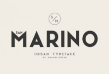
In the fast-paced world of digital design, grabbing attention and conveying messages efficiently is paramount. One design element that can dramatically elevate your visual content is the use of condensed fonts. These fonts, characterized by their narrow letterforms, offer a range of benefits that go beyond just saving space. Whether you’re designing a website, creating social media graphics, or laying out a print ad, condensed fonts can enhance clarity, aesthetics, and functionality. Here are six compelling ways condensed fonts can improve your visual content:
Maximize Limited Space
One of the most practical advantages of condensed fonts is their ability to fit more text into tight spaces without sacrificing legibility. This is particularly useful for designs with strict spatial constraints—think of posters, mobile interfaces, or product packaging. When space is at a premium, using a condensed fontallows you to include essential information without overcrowding your layout. Designers often turn to these fonts to maintain balance and structure while still delivering a comprehensive message.
Create a Bold, Impactful Look
Condensed fonts naturally have a strong visual presence. Their tall, slim shapes often convey intensity, strength, and urgency, which can instantly draw the viewer’s eye. This makes them perfect for headlines, call-to-actions, and any content meant to stand out. When paired with bold weights, condensed fonts can create an authoritative and memorable impact, setting the tone for your entire design.
See also: Hoist for Construction Material: Essential Machinery Transforming Modern Job Sites
Improve Readability in Hierarchical Design
In complex layouts, such as editorial spreads or infographics, establishing a clear visual hierarchy is crucial. Condensed fonts help distinguish different levels of information by varying size, weight, and spacing without breaking the visual flow. You can use a condensed typeface for subheadings or secondary content, ensuring that your main message remains dominant while supporting elements are still easy to read.
Enhance Modern and Minimalist Aesthetics
Today’s design trends lean heavily toward clean, minimalist aesthetics, and condensed fonts fit this style perfectly. Their sleek and structured appearance contributes to a streamlined look, which is especially effective in tech, fashion, and editorial design. When used appropriately, a condensed font can add a modern edge to your content, conveying sophistication without being overbearing.
Allow Greater Typographic Flexibility
Condensed fonts offer more flexibility when working with longer text elements within limited areas. For instance, in branding or logo design, a long company name may not fit neatly in standard-width fonts. A condensed font allows you to scale text without distorting proportions or compromising brand consistency. This flexibility also comes in handy for responsive web design, where text needs to adapt to different screen sizes gracefully.
Stand Out with Unique Character
Many condensed fonts carry distinctive design features that make them instantly recognizable. From geometric sans-serifs to stylized serifs, condensed typefaces often bring a unique flavor that can reinforce brand identity and set your visuals apart. When used thoughtfully, these fonts can act as visual signatures—elevating your content from generic to iconic.
Conclusion
Condensed fonts are far more than a way to “squeeze in” extra text. They are powerful design tools that can enhance the structure, aesthetics, and effectiveness of your visual content. Whether you’re aiming for bold expression or subtle elegance, these fonts offer a versatile solution for modern design challenges. As with any design element, the key lies in balance—pair condensed fonts with appropriate spacing, contrasting typefaces, and thoughtful layouts to unlock their full potential.